Boxes & Arrows: Building the UX Dreamteam
There's an interesting article on B&A about Building the UX Dreamteam by Anthony Colfelt. Worth the read.
I've added my comments about the article on the B&A site, rather than here.
There's an interesting article on B&A about Building the UX Dreamteam by Anthony Colfelt. Worth the read.
I've added my comments about the article on the B&A site, rather than here.
This video illustrates some useful Best Practices from a UX standpoint.
(Thanks to my colleague Tim Francis for pointing me to this video)
Virtual Hosting Blog has compiled a list of the Top 100 User-Centered Blogs. Shockingly, my blog did not make the list. This is an outrage!! I blame the hanging chads!! Stalin was right!!
Okay, so I only have one reader (Hi, Mom!), so maybe it's not a complete shock. (I'm just kidding -- my Mom doesn't actually read my blog)
Regardless, this is a really useful list of sites, and unfortunately highlights to me just how hard it is to keep up on everything that is going on.
Time to update my feeds.
Jason at 37signals has an interesting post about why they don't use personas:
Every product we build is a product we build for ourselves to solve our own problems. We recognize our problems aren’t unique. In fact, our problems are probably a lot like your problems. So we bundle up the solutions to our problems in the form of web-based software and offer them for sale.We recognize not everyone shares our problems, our point of view, or our opinions, but that verdict’s the same if you use personas. Making decisions based on real opinions trumps making decisions based on imaginary opinions.
I’ve never been a big believer in personas. They’re artificial, abstract, and fictitious. I don’t think you can build a great product for a person that doesn’t exist. And I definitely don’t think you can build a great product based on a composite sketch of 10 different people all rolled into one (or two or three).
In addition to the post itself, the comments are really well-written with good points made in both directions.
For me, what's interesting is that I am known for not being a big fan of personas, and yet I think Jason is completely off the mark in his criticism. Or, to be fair, he highlights good reasons why 37signals doesn't need to use personas, but doesn't seem to recognize that those reasons don't apply to many other teams - 37signals is not a representative company. They are the exception, not the rule, because they strongly believe that they are the users of their own products. Not only is this unusual, in my opinion it's also not sustainable.
The other mistake he makes is that he thinks personas are meant to replace talking to real people. Of course, the truth is the opposite - personas are the output of talking to real people. For most organizations, it's just not feasible for every person in the organization to talk to real people and have the skills to successfully interpret what they actually mean and not just what they actually say. For the people who do talk to people and do have those skills, we need a way of communicating the results of those discussions to the rest of the team. Personas are one way to do that.
(Of course, it goes without saying that like any technique, there are teams that do personas poorly, but that is a reflection on that team, not the technique)
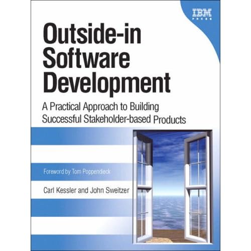
Carl Kessler and John Sweitzer (two IBMers) have written a new book called Outside-in Software Development.
This book occupies an interesting spot in the UX-related book landscape. It's not really about design, exactly, nor is it prescribing a particular software process. It's written by an executive with experience on the management side of building software (Kessler) and an architect with experience on the technical side of building software (Sweitzer), and neither of them have ever been User Experience Professionals.
And the target audience isn't UXers. I think it would be most useful for people in charge of software projects, including marketing, product management, managers, architects, and developers. I think UXers will enjoy it as well, but mostly because you'll find yourself nodding and saying "Damn right!" throughout the book - which is nice when reading a book written by a non-UXers.
However, there are some ideas in the book that were new to me as well. One in particular that I liked is that the authors argue that when you build up your list of key stakeholders for a products (including end users and business sponsors), you should also include your internal stakeholders and their goals. This surfaces explicitly that sometimes internal stakeholders have goals that are in conflict with each other... and sometimes the end users. For example, developers are internal stakeholders and they usually have a clear goal of completing their code on time - which can lead to a conflict of interest. It's not a new thought that developers can have a conflict of interest, but it's a new thought (to me) that we should document that goal when defining a product's stakeholders. Get it out in the open. Talk about it. That's a really good idea.
Mainly I found the book to be practical. Which is the highest form of praise for a book like this... and rare. It has fairly easy to implement ideas on how to shift towards outside-in thinking, and doesn't expect people to make a wholesale change to their processes in one fell swoop. They also discuss common mistakes (often with personal examples) and how to avoid them - such as trusting that your customers know what their own requirements are. And best of all (from my perspective), the book applies to enterprise software, not just building little websites. It doesn't assume that everyone on a project team is co-located and can fit in a single conference room with a whiteboard.
Anyway, I recommend the book highly.
(Full disclosure - in case anyone hasn't read my profile, I work at IBM too. I don't know Carl or John, but I've had one or two meetings with them over the years. I wasn't involved at all in the book - I didn't know anything about it until after it was published.)
By the way, Carl also has a blog dedicated to Outside-in Thinking.
I'm dealing with an interesting situation right now. I'm trying to create a list of user experience "roles" with short descriptions. I'm using "role" here in the usual sense - not a job description but a set of closely related tasks and responsibilities that tend to be performed by a single person. And of course a single person might handle multiple roles.
This has been done plenty of times before, and for the most part it's pretty straightforward. There's a "user researcher" related role, an "interaction designer" related role, and a "usability tester" related role.
But there are a couple places where things get tougher.
First, how does one describe a "UX architect" role in a way that distinguishes it from the other roles. Given that I'm a UX architect, you'd think this would be a piece of cake, but I'm struggling with it. I have plenty of anecdotes that describe what I do, but distilling it down into a short description or bullet points is eluding me.
Second, how do you distinguish between a UXer who does interaction design and a "developer" who does interaction design? Obviously there are plenty of technical architects who spend their time on design and not coding, but we also have non-architects with development backgrounds who spend all their time on low-level design and don't do any coding. Are these people "UXers"? As someone who thinks my undergraduate and graduate degrees did close to nothing to prepare me for my career in user experience, I don't think there's any reason why someone can't "convert" from a different domain to user experience. But I can't shake the feeling that there's something vaguely different about the roles that has nothing to do with ability.
I wonder if all professions are as imperfectly defined as our's, if you're looking at them from the inside?
Thanks to some international travel, a nasty flu bug, and transitioning into a new job, I've been completely buried the last few weeks. I haven't even had time to watch all of my "Jekyll" DVD, much less blog.
I'm starting to see the light at the end of the tunnel now, so I should be back to my regular blogging routine soon. I feel completely out of the loop because I've missed so many new blog posts in my blog reader... I'm a little panicky about it... I wonder if that's healthy?
I went to London for a couple days at the end of last week for a customer visit. My first time in London, but unfortunately the quick turnaround didn't leave much time for sightseeing. Here's a couple of my favorites pictures that I snapped:


Courtesy of Putting People First, I found this great article on the need to improve the user experience of computers from The Economist.
A few excerpts:
Consider the Nokia 6680 mobile phone, says Adam Greenfield, an expert in computing culture at New York University and the author of “Everyware”, a book about the future of computing. He found that 13 clicks were needed to change its ringtone. “It's an interface designed by engineers for engineers,” he says.Good stuff.
...
Making computers simpler to operate would help the people who use them and the companies that produce them. Ease of use is one area where technology firms can differentiate themselves and gain competitive advantage.
...
But making computers simpler to use will require more than novel input devices. Smarter software is needed, too. For example, much effort is going into the development of “context aware” systems that hide unnecessary clutter and present options that are most likely to be relevant, depending on what the user is doing.
...
Cars fitted with sensors and cameras collect data on the driving styles of test participants, including their acceleration and braking patterns, assertiveness in changing lanes, and so on. The navigation computer then picks a route that accommodates each driver's strengths and weaknesses. The system works fine—but when drivers are told what is happening, they get angry. This suggests, says Mr Dey, that contextual computing needs to be discreet: such systems are, in effect, judging people and trying to influence their behaviour. Systems that manipulate people, he says, may have to keep quiet about it to work.
Joshua Ledwell has an interesting post over at Compete On Usability called "UX practitioners rated." The comments are also worth reading, because Lou Rosenfeld, who runs the UX Zeitgeist page, has jumped in with some explanations of the effort.
I had to jump in as well.
(Side note: I originally only used Joshua's first name in this post, but then I thought, "Without the last name, Yahoo won't know who I'm talking about, and Joshua will lose some well-earned zeitgeist! Better add the last name..." )
The latest UIEtips article has an interview with Steve Mulder about personas. Here's an interesting exchange:
I understand what Mulder is saying here, but I'm not convinced. The issue is that lots of people think they know about users, but they are often wrong (or myopic based on their own experiences). They rely on anecdotal evidence, faulty assumptions, and personal bias to make design decisions. If you take that and build a persona from it, all you are doing is formalizing the mistake. And that makes it even harder to correct in the future. And in my experience, even if you think everyone understands that these quasi-personas are a first step towards real personas, at some point someone will question the future investment in user research because "We already have personas!"UIE: When design teams don't have the time or budget to perform user research, do you recommend teams create personas based on who they believe the users of their web site or design really are?
Steve: I think personas not based on actual user research are absolutely better than no personas at all. A lot of customer and user knowledge already exists in many organizations, and by looking at the sales, marketing, product, customer support, and tech support perspectives, you can bring all these existing bits of knowledge together into personas without talking to any actual end user. If you design teams can't easily talk with ends users, this is the most effective way to try out personas for the first time.

Courtesy of Joe Lamantia, I found Dan Ward's "The Simplicity Cycle". It's a quick read, it's free, and it's insightful... all good things. It basically centers around the graph to the right, which represents a product lifecycle.
The idea is that you start in the lower left hand corner, which is "simplistic" in the sense that it's simple because it doesn't do much. As new features get added, complexity increases but so does "goodness" because the user can do more stuff.
But then at some point you reach the middle of the graph and things get interesting. It's basically the complexity "tipping point", because now when you add more stuff (a.k.a. complexity), goodness starts to go down because users are unable to consume the additional complexity. The only way to increase goodness at this point is to decrease complexity.
That's the gist. I recommend reading the whole thing to get the details.
I like this for a couple reasons. First is that it suggests that complexity is not inherently bad. I couldn't agree more with this. Designers who think "simplicity" is the goal of design live in a different world than I do. I also like that Ward uses the term "unnecessary complexity", which is a favorite phrase of mine. Just because complexity isn't inherently bad doesn't mean that there isn't plenty of unnecessary complexity in most software.
I also like that it helps answer the question, "Hey, my product is complex AND successful, so why should I worry about design?" There's a limit to how many features you can add to a product before they become self-defeating. When your customers start to request features that are already in your product, it's a safe bet that adding even more features is going to be trouble.
So I think the graph represents a very useful concept, and makes it easy to understand.
Of course, like most concepts, if we starting poking on it we can find limitations. For example:
Courtesy of Usability News, I found this slideshow about user experience created by the team that helped design the iPhone. This is nothing new to UX practitioners, but it might be useful when selling UX to stakeholders.
In every software release, there are always resource constraints. It's an immutable fact of life, like the sun rising in the east or your toast falling butter side down. There's not a lot of value in complaining about it... and pretending that your work should be done without regard to resource constraints or ship dates will lower your credibility.
However, even if we accept that resource constraints are a fact of life, it still can be the case that these constraints are inappropriately impacting the user experience. In other words, resource constraints are an issue for everyone in every discipline, but sometimes the impact on one area is out of whack with what other areas are facing. One way in which this can happen to user experience is via bad development tooling and frameworks.
Development tools and frameworks are intended to make developers more productive. When done poorly, they can create a situation where developers are more productive if they follow a single path, but any deviation from that path results in a huge development effort. And deviating from that path is often requested by the UX team. This can result in mind-boggling conversations like, "Sorry, I can't change the label on that button... the framework is giving me the label, and I would need to custom code the entire page to change it." The trick is to recognize when a developer is feeding you a line of crap to avoid extra work versus when there really is a tools/framework issue. Or both!
As an aside, one area where I've repeatedly seen this issue is in the area of product installation tooling. These try to make things easier by giving the developers a bunch of common install functions for free. But it's often an all or nothing proposition... you either use the common function EXACTLY or you have to start from scratch. So there's a resource cliff. A minor design change creates a huge impact on the development sizing. So as a designer you get stuck with accepting a bunch of minor irritating behaviors because none of them individually are worth throwing out the free behavior.
As with most roadblocks, we UXers often have to live with them rather than remove them. Removing the roadblock in this case obviously means choosing new tools or creating better frameworks. Sounds good, and worth fighting for, but that doesn't happen overnight. In the meantime, what can we do to detour around the roadblock? Here's my advice:
I ran into an interesting usability issue recently. I was trying to cancel some magazine subscriptions through the Magazine Service Center. The Magazine Service Center is basically a scam, though a legal one. Their business model is basically to give people free subscriptions to magazines, then automatically start charging for them after a year has passed, and make it as difficult as possible to cancel them.
When you call them to cancel (which of course can't be done online), you are never given the option to speak to a human. After navigating through the list of options to get to the cancellation prompts, they won't give you a list of magazines that you are currently subscribed to. You have to say what magazine you want to cancel, then they repeat it back to you, but the response comes back garbled so that you're not sure whether it's right. I said, "National Geographic Explorer" and they responded, "You said, 'Fghwhpfft', press one if that is correct". I tried this several times with the same unintelligible response before just assuming they'd figure it out and moving on.
Then the fun really starts. They say they want to "confirm" you decision to cancel. They say that you still have a few weeks left on your subscriptions. There's a fee for canceling. If you don't cancel now, they'll waive the fee. And they ask you to confirm that you want the fee canceled. In other words, to confirm that you want the magazine canceled, you have to respond "NO". When you select "No", they go through it again, to "make sure they understand", and you once again need to select "No" to confirm the cancellation of Fghwhpfft.
So the question is: Is this bad design? It's completely unusable. But it's completely unusable on purpose. It's completely unusable in order to meet their business goals. And, to be honest, it's unusable in clever ways, not by accident. Someone spent a fair amount of time and thought to design the system in a way that maximized the user's failure rate.
Of course, this brings up ethical issues. I doubt many UXers have to make these types of decisions - choosing between good usability and good business. Fortunately, the two are almost always aligned. But in subtle ways, I think it does appear. Such as how easy should it be to migrate from your product to another vendor's product? Users want to avoid vendor lock. Business goals don't always agree.
I'm trying to think of other examples, but I'm drawing a blank.
... and out of undergrad for 17 years.
So isn't it about time that I stopped having these "Omigosh! The final exam is today and I forgot to attend class all semester!" stress dreams? My subconscious is stuck in the early '90s.
Maybe if I updated my music collection with some post-1995 tunes it would help.
Nah, too risky.

A colleague forwarded this link to me - http://www.dontclick.it/
It's a browser interface that completely removes the need to click the mouse button. I'm not sure that there's a problem worth solving here, but it's an interesting exercise.
My wife needs a new laptop. We went to Best Buy. We found the laptop we wanted, with all the right stuff on it, at a price that we felt was reasonable. Just one minor issue. Like most laptops, this one idiotically had 1 Gig of RAM to run Vista Home Premium, so we needed to upgrade it to 2 Gig.
Me: "How much is a Gig of RAM for this laptop?"
Best Buy Employee: "About $120."
Me: "Sounds good. We'd like to get this laptop, but we want to upgrade from 1 Gig to 2 Gig."
BBE: "Okay, that'll be an extra $240."
(pause)
Me: "Uh, sorry... I just need 1 extra Gig of memory. That's $120."
BBE: "No, the laptop has 2 memory slots. Right now it has two 512MB memory cards in them, so you'll need to buy two 1 Gig memory cards to get to 2 Gig."
Me: "Riiiight... but I don't need the two 512s, which cost $120, so it's still only a $120 difference."
BBE: "No, you're buying the laptop as is, so the two 512s are your's, and to upgrade you need to buy the two 1 Gigs for $240."
Me: "And then I just throw away the two 512s?"
BBE: *shrugs*
Me: "You do understand that you've just lost this sale, right?"
BBE: *shrugs*
As my wife will happily tell you, I have many, many faults. For example, I am incapable of finding the ketchup in the refrigerator. My wife can talk on the phone, make a craft, help the kids with their homework, and watch Oprah at the same time... I can watch a bad movie for two hours and not notice the house is on fire. My fashion sense has not changed or improved since I discovered jeans and t-shirts in second grade.
And I consistently hold my own opinion in higher regard than it deserves.
On the bright side, I eventually recognize that I was an idiot... it just takes about a year. Then I look back in horror at how incompetent I was. This became a yearly rite of passage for me - marveling at my newfound wisdom compared to the previous year. It was nicely validating for awhile, until I started looking ahead and wondering what I was doing now that I'd be embarrassed about next year. Takes all the fun out of feeling superior to... er, myself.
Looking back over my learning curve to date, one thing that strikes me is that in addition to simply learning through mistakes and casual chaos, I've always worked with a team of user experience professionals, and they are the ones who have helped me grow into the proud, just-beyond-incompetent UXer that I am today. I don't think you can overestimate how important that is - UXers who are isolated on development teams are almost doomed to stagnation, IMO. For those folks, the only way to avoid this fate is the virtual UX team on the internet. Bravo to all the UXers who make the net a vibrant community from which to learn.
Which brings me back to my original point - what am I going to learn over the next year that is going to make me feel incompetent now? I'm not sure (if I knew, I'd just go ahead and learn it now), but it's very likely that I'll learn it from someone on the internet. Not in one place on one day... in a hundred blog posts and comments and articles and research, all providing a tiny piece of the puzzle leading to the next minor epiphany.
I'm looking forward to it. In the meantime, I'll just have to make do with what I've learned so far. And ask my wife to find the ketchup for me.
There are a thousand different ways to manage requirements and plan a release. One of the all too common methods is to make a list of the biggest, most important requirements and rank them from top to bottom based on "customer need". Of course, "customer need" can mean anything from "an executive already promised this to a customer" to "marketing thinks this feature will enable us to get into a new market". If you've been on a team that used this method, you know what happens... people learn that the best way to get your favorite requirement into the product is to make it as big and sexy as possible. Because once you have the ranked list, sizings are done and once the resources run out you've got your list of in-plan requirements. If your requirement isn't near the top, now matter how easy it is to do or how great the ROI is, it won't make it in.
This is a bad method for lots of reasons, but it particularly hurts the user experience. First, the overall user experience is made up of a ton of small interactions, and often the best way to make improvements is to fix a lot of small issues rather than add some groovy new "user experience feature" while leaving the small issues alone. Those small issues add up quickly. But comparing any of the small fixes to one of the big sexy requirements makes the small fix look optional.
Second, this type of process encourages a "feature-centric" view of release planning. The discussion naturally becomes focused on which of two features is the most important... and tends to avoid the discussion of whether either feature is the best way to spend those resources. Making the existing features better gets lost in the mix.
If you are stuck in this situation, you might not have the ability to force a wholesale change to the process (which is what is ultimately needed). If that's the case, here's some pragmatic advice on how to get around this particular roadblock (based on my own experiences):
Howard Kaplan over at grokdotcom has posted a little rant about usability. For example:
About a month ago, I had the opportunity to speak to a group of Usability professionals. The theme of my talk was getting them to raise the bar within their industry; to become true advocates for consumers like they should be. Yes, consumers, not "users". B2B, b2C, self-service, e-commerce, video, web2.0, no matter the focus of your site, or whether a nickel changes hands, your audience consumes the content you provide and engages with the experience you've planned.And a littler later:
I often challenge people to come up with positive associations with the term user. I'm still waiting for one positive response. Sure, I've heard "Mac user" and even that falls flat given the very real problems with technology — yes, even with Macs — that rear their ugly head at the most inopportune of times.This is interesting on several levels. First, I find the crusade against the term "user" to be deeply amusing. Howard wants positive associations with the term user? Okay. How about the thousands of times when a usability professional has been in a meeting and said, "We can't do it that way because our users will never figure that out" (or words to that effect). It's an internal industry term that is perfectly useful, and is not in anyway derogatory in the way it is used... quite the opposite. 90% of our job is to treat users with respect... and the other half is to make users happy.
What brought on this little rant? Our friends across the pond at E-Consultancy came up with a list of their hall of fame "User Experience gurus" based on a survey of their audience. Our esteemed founders, Jeffrey and Bryan, were selected for the list. Flattered as Jeffrey and Bryan were, those who've followed our work over the years know our collective disdain for the casual use of the "guru" label these days.In case you didn't read Robert's post from last week, where Jeffrey suggests that we marketers need to "get over" ourselves, it should give you some context. A few days later — while, as Jeffrey put it, the woman behind the counter at his local Starbucks still didn't know who he was despite all the publicity
– another list came out with an amendment to the E-Consultancy list where both Seth Godin, and Eisenbergs were left off. This new list was created by David Armano, who runs the widely popular Logic + Emotion blog. (If you haven't read David's stuff, his manifesto is what converted me into a regular reader. Although I often disagree with his approach, Logic + Emotion comes highly recommended.)
David's perspective in removing Seth, Jeffrey & Bryan was that they're too much in the marketing camp to be considered "User Experience". My question, though, is this: "Would you prefer to have the experience designed by a top Information Architect but never planned with a deep understanding of the audience's needs? Or would you prefer to plan the experience according to human motivations, then adjust the architecture to match?"
I think you know my answer.
My answer is that it is not an interesting question because both approaches would be broken. I would also say that one of my frustrations is people who think that the "user experience" of a product is the responsibility of the user experience team. It's not. It's everyone's responsibility... including marketing. Just like the "quality" of a product is not the responsibility of the test team. So I fully acknowledge that marketing has a central role in user experience. That doesn't make marketers into user experience professionals though - it's still a different skill set. It's the collaboration between the skill sets (and many others) that creates a good user experience, so trying to figure out which skill set is easiest to drop is not a useful exercise, IMO.
Simple question. If I'm using a wizard in a web application (and the wizard has a Back button) and I click the browser's Back button instead of the Back button supplied by the web application, should the behavior be the identical?
Simple question, but the answer? Ugh.
There's a lot of discussion on this topic on the web, but interestingly the focus of much of the discussion is how to get users to stop using the Back button. Whether it be by providing them with back buttons in the app, adding breadcrumbs, or disabling the back button altogether. This strikes me as quite an odd solution to the problem.
At the same time, there are times when the back button is clearly inappropriate. If I have just finished clicking "Finish" in a wizard and I'm taken to a "Okay, here's what just happened" page, clicking the browser's back button is not a good thing.
But if the web app itself supports a Back button, why should it not also support the browser's Back button? And, if you agree with that, let me ask the next question. Should you be able to click the browser's Forward button and have it work like the "Next" button in the wizard?
My head hurts.
The folks at Adaptive Path recently announced their 2nd "MX conference", which focuses on, basically, how to actually get things done. In the announcement, they say:
The unsung heroes are those folks who shepherd projects through an organization, demonstrating the value of an experience design approach, ensuring that their product maintains quality in the face of competing priorities. Such shepherding is hard, but is necessary for design to succeed.This is why we created the MX Conference. MX stands for Managing Experience. It exists to fill the void between the practical discussions craft, and the hand-wavey discussions of The Power Of Design. The event is focused on helping people understand what it takes to get great experiences out into the world, in the process building a community of folks addressing similar challenges.
Bravo! On this blog, I've touched on this topic a couple times (like here, here, and here). Basically I feel a sense of frustration that more thought and effort isn't spent on what I would consider to be the core issue that faces most user experience professionals - how difficult it is to get improvements into a product. We spend a lot of time talking about how to create a good design, and we do a lot of chest-thumping about how important good design is, but as the post above notes, there's a large void between these two.
Don't get me wrong. I think good design is hard. I think it's reasonable that this is a major topic of conversation. I think as a profession we still have plenty to learn in this space. In addition, I think it's obvious that we've got a long way to go in changing the default IT culture so that the importance of experience design is a foregone assumption - so some chest-thumping is warranted.
But in some sense those are the easy problems to solve. I am guessing there are lots of places that fit each of the following three criteria:
1. They have quality user experience professionals on staff
2. They have an organization that understands the importance of experience design
3. Getting actual improvements into the product requires navigating around 100 roadblocks and an Act of God
I think the reason more time isn't spent on this subject is that it's uncomfortably murky. The roadblocks aren't the same from organization to organization. It's not always clear who in an organization should be the shepherd. And, to be honest, I think there are user experience folks who feel that their job is to create quality design... and if that design doesn't make it into the product, they've still done their job.
But personally, I think a lot of the roadblocks are common (though not universal), and it would be good for the UX community to discuss techniques for getting around them. It won't be a one size fits all solution, but I think we have a lot to learn from each other here.
UIE has posted a short interview with Scott Berkun, author of The Myths of Innovation, which I have reviewed previously.
The best part of the interview is Berkun's response when asked whether there are situations when teams should NOT focus on innovation. Berkun replies:
Yes! Thanks for asking! I think innovation is overrated. Customers don't care about how innovative you are. They just want to be happy and satisfied. And that's about good design.The best advice I can give is to focus on people and their problems. Few great innovators worried about anything else. The fact that they found a new idea had more to do with their passion for solving someone's problem than anything else. Innovation is a huge distraction these days. That's one of the myths I hope people will understand how to dispel from reading the book or attending my seminars.
I thought this was great, because I've always felt there was something hokey when companies encourage innovation for the sake of innovation. Who cares about innovation if the innovation is useless? The trick is create a culture in which problems that don't seem to have an existing solution are seen as opportunities for innovation, rather than dead ends. It's all about problem solving.
Croc o' Lyle points us to a great faux letter that was apparently created by Software Technology Support Center. The letter is a PDF, but I've cut-n-pasted it here for your reading convenience:
Dear Mr. Architect:
Please design and build me a house. I am not quite sure what I need, so let’s get started. My house should have between two and 45 bedrooms. Just make sure the plans are such that the bedrooms can be easily added or deleted. When you bring the blueprints to me, I’ll make the final decision about what I want. Also, bring me the cost breakdowns for each configuration so I can arbitrarily pick one at a later time.
Keep in mind that the house I ultimately choose must cost less than the one I am currently living in. Make sure, however, that you correct all the deficiencies that exist in my current house (the floor of my kitchen vibrates when I walk across it, and the walls don’t have nearly enough insulation in them).
As you design, also keep in mind that I want to keep yearly maintenance costs as low as possible. This should mean the incorporation of extra-cost features like insulated windows or composite siding. (If you choose not to use Anderson insulated windows, be prepared to explain you decision.)
Please take care that modern design practices and the latest materials are used in construction of the house, as I want it to be a showplace for the most up-to-date ideas and methods. Be alerted, however, that the kitchen should accommodate (among other things) my 1952 Gibson refrigerator.
To assure that you are building the correct house for our entire family, you will need to contact each of my children and our in-laws. My mother-in-law will have very strong feelings about how the house should be designed, since she visits us at least once a year. Make sure you weigh all these options carefully and make recommendations. However, I retain the right to overrule any recommendation you make.
Please don’t bother me with small details right now. Your job is to develop the overall plans for the house and get the big picture. At this time, for example, it is not appropriate to be choosing the color of the carpeting; however, keep in mind that my wife likes blue.
Also, do not worry at this time about acquiring the resources to build the house itself. Your first priority is to develop detailed plans and specifications. Once I approve these plans, however, I would expect the house to be under roof within 48 hours.
While you are designing this house specifically for me, keep in mind that sooner or later I will have to sell it to someone else. It should — therefore appeal to a wide variety of potential buyers. Please make sure, before you finalize the plans, that there is a consensus of the potential home buyers in my area that they like the features of this house.
I advise you to run up and look at the house my neighbor built last year, as we like it a great deal. It has many things that we feel we need in our new home, particularly the 75-foot swimming pool. With careful engineering, I believe you can design this into our new house without impacting the construction cost.
Please prepare a complete set of blueprints. It is not necessary at this time to do the real design, since they will be used only for construction bids. Be advised, however, that you will be held accountable for any increase of construction cost as a result of later design changes.
You must be thrilled to be working on such an interesting project! To be able to use the latest techniques and materials and to be given such freedom in your designs is something that can’t happen very often. Contact me as soon as possible with your ideas and completed plans.
Sincerely,
The Client
PS: My wife just told me she disagrees with many of the instructions I have given you in this letter. As the architect, it is your responsibility to resolve these differences. I have tried in the past and have failed to accomplish this. If you can’t handle this responsibility, I will have to find another architect.
PPS: Perhaps what I need is not a house at all, but a travel trailer. Please advise me as soon as possible if this is the case.
Todd Wilkens of Adaptive Path expressed some frustration about usability:
When talking of a great writer, how often do people talk about how amazingly legible they are? When talking about a great photographer, does anyone ever talk about the fact that his prints actually developed and thus are visible? Obviously, the answer is no. Legibility and visibility are the bare minimum of requirements for a successful piece of writing or a photograph. Any person who focused most of their efforts on legibility or visibility would probably have almost no chance of being a successful artist. Something that is fundamental to great creative acts is aiming high. If your goals and strategies are not oriented toward excellence then it is highly unlikely that your tactics will get you there. No one tells their kids to aim for a C- and then expects them to get an A.
So, why oh why do people in this day age still hold up “usability” as something laudable in product and service design? Praising usability is like giving me a gold star for remembering that I have to put each leg in a *different* place in my pants to put them on. (Admittedly, I *do* give my 2 year old daughter a gold star for this but then she’s 2.) Usability is not a strategy for design success. The efficiency you create in your interface will be copied almost instantaneously by your competitors. Recently, I’m even coming to believe that focusing on usability is actually a path to failure. Usability is too low level, too focused on minutia. It can’t compel people to be interested in interacting with your product or service. It can’t make you compelling or really differentiate you from other organizations. Or put another way, there’s only so far you can get by streamlining the shopping cart on your website.
Obviously this can lead to a religious terminology war, but for the purpose of this post I'm going to assume that Todd defines usability as "making sure that users can complete their tasks with a reasonably low failure rate"... and nothing else. Of course, I agree with Todd that this is just the beginning of designing a quality product, but I think perhaps he's not giving usability enough credit. Here's why:
1. I think it's nearly impossible for an organization to successfully focus on other aspects of experience without first becoming (at least) competent in basic usability. It's a step that can't be skipped, for all practical purposes. So an organization that went from nothing to doing basic usability should be praised for making progress, because they couldn't have chosen to go beyond basic usability in step one anyway.
2. Great artists break the rules... but great artists know the rules. If an artist creates a masterpiece by breaking rules that the artist didn't know about, it isn't genius, it's luck. In some sense, basic usability means "knowing the rules". For example, whenever we talk about the value of consistency in my job, I always make the point - it's okay to not be consistent, as long as the inconsistency isn't done out of ignorance, but by design. Usability is the foundation for everything else.
3. And last but not least... usability is HARD. Look around. We're surrounded by unusable crap. (I was editing a wiki page today and my username timed out while I was editing, so when I tried to save, it prompted me for my id and password, then took me back to the wiki homepage and threw away my work!) There are many, many roadblocks to creating a product that is usable in even the most basic sense. Kudos to the ones that achieve it. Is it enough? No, but for most teams it's a praiseworthy first step.
After a long weekend of taking my son to the Smithsonian Institute for his 9th birthday, here's a few of the things I missed while I was out:
Yahoo! Photos is closing. I got an email from them over the weekend. Here's a section of it:
We will officially close Yahoo! Photos on Thursday, September 20, 2007, at 9 p.m. PDT. Until then, we are offering you the opportunity to move to another photo sharing service (Flickr, KODAK Gallery, Shutterfly, Snapfish, or Photobucket), download your original-resolution photos back to your computer, or buy an archive CD from our featured partner (for users of the New Yahoo! Photos only). All you need to do is tell us what to do with your photos before we close, after which any photos remaining on Yahoo! Photos will be deleted and no longer accessible.
Of course, we hope you'll join us at Flickr (you can even use your Yahoo! ID), but we also realize that Flickr may not be for everyone. In the end, we want you to find the service that's right for you, and we hope you take some time to learn more about your options before making this important decision.
Nielson on good articles, shallow blogs. Me no likey. Think Nielson misses point. Will write more after I find my crayons.
I took the kids to see Fantastic Four: Rise of the Silver Surfer yesterday. In the commercials before the movie, there was this:
So the commercial has demons living in the sewers who emerge to attack the "sheeple". The demons decapitate the sheeple, play with the decapitated heads, slip into the skin of the sheeple, and, apparently, customize their cars. The demons are the good guys in the commercial. My 8-year old son had nightmares last night from that commercial... seriously. And the worst part is, I bet Scion would be happy to hear that. This reminded me of another recent commercial, where a cellphone company was trying to sell a new feature that, I guess, allows to text message multiple friends at a time. What should you do with this feature? Apparently arrange so that you and your friends can all simultaneously vandalize a grocery store. Again, the people doing the vandalizing are the good guys in the commercial. The target audience. This is not trend I'm happy about.
Compare that to this Liberty Mutual commercial:
How do you want your company to advertise?
UIE has an excellent article from Kim Goodwin called, "Ten Ways to Kill Good Design". I don't have much to add, other than, "Yeah, what she said!" In particular, she nails one of my pet peeves - developers making business decisions. She says:
When we say the inmates are running the asylum, it means the programmers are making business decisions that should be made by executives. In most cases it's not intentional, and the majority of people are unaware of the extent to which it happens. However, every time a programmer says "That's not technically feasible," he's just made a business decision that's invisible to most people, since "not technically feasible" really means "not in the tiny amount of time or with the constraints I know you're going to give me."I have an enormous amount of empathy for developers. They often have unreasonably huge amounts of work to do and unreasonably tiny amounts of time to do it in. But when a requirement is in plan and then the developer guts half the requirement by saying "no" to designing it well, that's a business decision that needs to be made somewhere else.
File this one under "Damn! I wish I was smart enough to have written this!" - Adam Greenfield has a great blog about experience design on Speedbird. This opus makes me look pithy, but it's worth reading the whole thing.
The clear intention was to ensure that the customer interaction inscribed in each of these phases was designed to the same high standards as an IDEO mouse or shopping cart. But with the best of intentions, this way of thinking led Acela into error.I could almost hear the clicking sound when several ideas bouncing around my head fell into place as I read this.The assumptions embedded in the plan are too tightly coupled to one another. They feed from one to the next - remember the word - seamlessly, like brittle airline timetables so tightly scheduled that a delay anywhere in the densely-interwoven mesh of connections cascades through the entire system. When it all succeeds, it’s magnificent, but if any aspect of it fails, the whole thing falls apart.
Functioning Form has a new entry about Design for the Edges: Managing Edge Cases. This is a fascinating topic for me, because in my opinion this is one of the core ways in which designing "enterprise software" differs from designing "consumer software". Enterprise software is not about achieving ubiquity, it's not about being "good enough", it's about satisfying the often very complex requirements for enterprises beyond what the "good enough" products can do. The edge cases aren't something to avoid... they are the core value proposition of the software. For example, Jamie Hoover in the article advises "Make your software as simple as possible. Less complexity decreases the possibility of edge cases in the first place." While this is obviously good advice in general, when it comes to most enterprise software, this is not useful whatsoever. The complexity of the system into which the enterprise software is plugging already exists. That complexity is the source of the requirements. By making the software "simpler", we'd simply be reducing the number of systems in which our software would be useful.
It's unfortunate that so much of our attention as designers has been focused on ways to simplify our own jobs to reduce the complexity of design problem by using techniques that try to find commonality across roles and scenarios... which makes our lives easier but oftentimes does not help our end users, who experience a much richer life that the one we've forced upon them.
Gian Sampson-Wild has penned a deliciously provocative article at A List Apart titled "Testability Costs Too Much." It is specifically about accessibility and the W3C, and asks the question - is it possible to have a good guideline that isn't testable? Sampson-Wild emphatically argues "yes". It's definitely worth a read.
But what got me thinking is how often this same question is brought up outside of the accessibility domain. Specifically, I've dealt with this in both setting usability objectives and when creating design guidelines.
It goes without saying that setting usability objectives for a product or a release is a good thing, right? I'm not convinced. Usability objectives can do as much harm as good. First, who decides whether the objectives are met? And how do they decide? Is it useful to have an objective that "The product will be easier to use than the previous release"? Probably not. But what if we operationally define the objective as "User satisfaction will increase from 3.2 to 4.0"? That seems testable. But if that is a release objective then it needs to be tested before the release is shipped. That means a late-cycle design validation. That means creating meaningful, representative scenarios for users to perform (often in a lab setting). And do you test the new features or do you use the same scenarios as the previous release to have an apples-to-apples comparison? if you just test the new stuff, is that valid? If you just test the previous samples, are you really testing the new release? How does it cost in time and resources to conduct the testing? If the objectives aren't met, do you delay the release? How much resource do you need to apply before you've got enough testing data to make a delay-the-release decision? Is it worth it?
Another option is to set objectives that don't require user testing. For example, you can use quantitative measures of user experience like step counts. An objective might be, "Completing this task will go from 27 steps to 10 steps." But this has a lot of problems as well. First, defining a "step" is easier than it sounds. Second, defining a "task" is easier than it sounds. Third, and I think most importantly, reducing the number of steps does NOT mean the task is more usable. You can improve usability by reducing steps, but it's not a guarantee. These quantitative measures of user experience are almost always secondary effects, which can lead to all kinds of problems. And in the end, these objectives still need to be "tested", usually by UXers, and although it is cheaper than user testing, there's still a ROI problem.
Compare this to just having a smart UXer on your team that you trust, and ask her "Do you think we've done what we intended to do in this release from a usability perspective?" Very high ROI.
Usability objective testing costs too much.
Now what about design guidelines? In this case, the "test" relates closely to Sampson-Wild's description "reliably human testable—which means that eight out of ten human testers must agree on whether the site passes or fails each success criterion." Now I'm going to extend this slightly to make it harder... a design guideline is testable if eight out of ten developers agree on whether guideline has been met. In many cases, guidelines are used because UXers don't have the resources to design everything in the product, and developers forced into design work need guidelines to help them make decisions. Of course, for UXers every guideline is "It depends". "It depends" is not a good guideline to give to developers. But damn it, design is HARD and the Truth is that the right answer really does depend on a bunch of factors that don't lend themselves to pithy guidelines that a non-professional-designer can consume and understand at a shallow level.
But if your developers are doing design anyway, then that's just tilting at windmills. Dumbing down your guidelines so that they are testable by developers is the right thing to do. In this case, I think the cost of making it testable is worth it. Coming up with guidelines that require expert interpretation when you know non-experts need to follow the guidelines is not useful, it's arrogance.
The first question is, why would anyone by a book that is actually a compilation of blog posts? Blog posts that are still available for free online for anyone who wants to read them. To answer that, a little background is in order.
Seth Godin is one of the new marketing gurus of the internet age, and runs an extremely popular blog (aptly titled Seth's Blog), as well as being the author is several books that extol the virtues of permission marketing and innovation. But pigeon-holing Godin as a marketer doesn't really tell the whole story. Godin is part marketer, part guru, part motivational speaker, part pundit, part critic... basically he has a strong belief in his own opinions, loves to share them, and enough people find enough of them to be insightful that an entire Seth Godin cottage industry has sprung up around them.
Since a colleague of mine pointed me to his blog awhile back, I read pretty much everything he posts. What I find most interesting is that I only find value in maybe half of what he says. Another 25% is what I would consider to be "motivational speaker crap". And the other 25% I simply disagree with. But holy cow, there's just so much of it, that even a 50% hit rate produces a lot of quality content. His book is the same way (not surprisingly, since it is from his blog originally). So why did I buy "Small is the New Big"? Basically, it was my way of supporting Seth's blog. It provided me a simple way of reading his archived blog entries in handy book form (for example, I could take it along to the pool during my kid's swim class), but mostly I just felt Godin had earned it.
Fortunately for Godin, I bought it online, because if I had picked the book up and turned it over and read, "you're smarter than they think" in big text at the top of the back cover I probably would not have been able to face the cashier at Barnes and Noble. Outside of Stuart Smalley, that's the kind of motivational speaker crap for which I have a very small tolerance. But here's the thing: I think Godin expects exactly this kind of reaction. In his introduction to the book, he says:
I guarantee you'll find some [blog entries] that don't work for you. But I'm certain that you're smart enough to recognize the stuff you've always wanted to do buried deep inside one of these riffs. And I'm betting that once you're inspired you'll actually make something happen.Why is Godin convinced that I'm smart enough (and doggone it, people like me)? Apparently because I was smart enough to buy his book. But more importantly, Godin knows that his hit rate isn't 100%. He's fine with that. He's fine with being all over the map. But I'm also guessing that the parts that I like are not the same parts that another person would like. It's about taste, not about being right and wrong. He also hits on another point, and to his credit he's self-aware enough to recognize it - many of his posts say what people already know, but there's value in being reminded of it. Reading the book, I repeatedly had the reaction, "Yeah, that's true, I knew that... I wonder how I can apply that?"
A colleague sent me a link to the proceedings for the latest UPA conference that was held in Austin, Texas last week. One of the items was a panel discussion entitled, "Looking in the Crystal Ball: Future of Usability". I particularly enjoyed the charts by Daniel Szuc from Apogee. One of his charts asks the question, "Who/What do we want to be?" followed by these bullets:
I love my iPod. There's something magical about burning several drawers full of CDs onto a device I can stick in my pocket. I even use iTunes to buy music, though not frequently.
(Side note: Hey, music industry, I have 1000s of songs on my iPod and NOT ONE of them is pirated. But I have two laptops, a desktop, two iPod shuffles, one iPod, one Disney MP3 player, and I'd love to find a car stereo that let's me store my music directly on the stereo instead of trying to remember my iPod whenever I drive somewhere. I have reason to copy my music between all these places. Stop making my life difficult. )
(Side note: Hey, Apple, that 99 cents-a-song thing was a great gimmick when you launched iTunes. But that what is was... a gimmick. It's over, man. First of all, 99 cents per song isn't cheap. Second of all, there's no real reason why all music should cost the same amount. Here's the deal - there's a whole bunch of music on iTunes that I'd pay a quarter to buy, but I won't pay a buck to buy. For a quarter, I'll try new things. I'll experiment. I'll get some older nostalgic songs from my misspent youth. For a buck, I'll get stuff I know I'll really like, and I'll be careful. If you took your music catalog and made half of it 25 cents a pop, you'd make more money.)
Anyway, back to the iPod and its UI. I had heard all about how "simple" the UI was. I expected to love it. Instead, I'm a bit shocked by some of the fundamental flaws in the UI that irritate me on a regular basis. Here's my top 3:
I interact with a lot of UXers in my company and elsewhere. Based on those interactions I have to ask, "Why do we spend so much time talking about the best way to evaluate usability or find usability problems?" It's clear that the biggest obstacles to overcome in order to deliver a usable product have very little to do with knowing what the usability problems are, and everything to do with figuring out a way to fix the usability problems you already know about.
I'm not saying that running usability tests is a worthless activity. I'm not saying we shouldn't think about running tests in new ways (particularly more efficient ways). But I think most products very quickly reach the point where they know about more usability problems than they have resources to fix. At this point the return on investment for discovering new problems is very low.
Obviously, most usability testing is done on NEW design going into a product (or website or whatever), so one might argue that in this case usability testing is still obviously needed. But again, in my experience this isn't true -- by the time the usability test is run, so many compromises have been made to meet schedules that the usability tester already knows what the user is going to complain about. It's just busywork at that point.
In my career, I've run precious few usability tests where I honestly did not know going in what the best design was, and the usability testing provided exactly the right insight that I needed to make the right design decision. I love those moments. But in my opinion they are the exception to the rule.
(Note: This opinion does not apply to user research, which I find is almost always valuable and worthwhile)
I'm a video game junkie. For the most part, I think video game systems are really good investments. Because my favorite genre is RPGs, and good RPGs are notoriously long, all I need is one or two great games to essentially justify the purchase of the system. For me, the comparison point for entertainment value is pulp fiction. I can go on Amazon and buy a paperback pulp fiction book for about $10. For example, I'm a big fan of Charlaine Harris, and I can pop over to Amazon and buy "Dead Until Dark" for $7.99 plus shipping. It probably takes me 5 hours to read a typical Harris book, so I'm paying about $2 an hour for the entertainment of book. This is roughly the same price I pay to watch a Netflix movie (Netflix should actually be cheaper, but I can never remember to return the damn movies after I watch them). Without concessions, going to the movies in the theater is a bit more expensive -- more like $4 an hour, but still fairly reasonable.
On the other hand, a video game system seems really expensive - we paid about $400 for our XBox360, and it didn't even include a game (or a second controller... grrr). If you include a game and a controller, the XBox360 was $500. Pricy, right? But let me pick one example from the XBox360 -- Elder Scrolls IV: Oblivion. This is one of my favorite games of all time. I am confident that I have played it for at least 200 hours. That means that if the only game I ever play on the XBox360 is Oblivion, I paid about $2.50 an hour for the entertainment value of the system. And considering that I've played many other games already on the 360 and that Fable 2 is supposed to come out this Christmas (the sequel to my favorite game ever), it's safe to say that eventually the entertainment value of the 360 will be pennies on the dollar.
We bought the Sony PS3 at Christmas for $600 and I have yet to play a game on it. Not one. Admittedly, one of the main reasons we bought it was the Blu-Ray support (high definition DVD), and we use that occasionally, but so far there just aren't any games I'm interested in playing.
And yet I STILL did not have buyer's remorse... until last night. I had a Blu-Ray movie I wanted to watch. I fired up the PS3 and it told me there was a required System Update that I needed to install. It had told me this a couple times and I ignored it, but I decided to bite the bullet last night and just install the thing before watching my movie.
An HOUR AND A HALF later the update was still not installed, there was no progress report (the PS3 would just periodically try to reboot itself to let me know it was still doing something), I was afraid to hard-reboot it (which is not a great idea during system updates) and I gave up and went to bed. This morning I checked on it and it told me... get ready for it... that it was now ready to install the update. That's right. During the hour and a half that it was doing whatever last night, it wasn't actually installing the update... it was just getting ready to install it. And it wasn't downloading it either, because it did that first (with a progress indicator, thank goodness, though it was a fake progress indicator) and we have broadband.
I wanted to throw the thing out the window.
What is Sony thinking?
It's important to distinguish between situations when a development team is not implementing your design because they don't have the resources to do it and when they are not implementing your design because they disagree with it (or, perhaps, think that design doesn't matter). Obviously the correct response to these situations is different. The trouble is that sometimes it's hard to tell the difference between them, because developers sometimes use resources as an excuse to not do designs that they really don't believe in.
I was talking to a colleague yesterday who was having an issue with her development team. The developers on the project had created a design that (I'm not making this up) utilized multiple levels of tabs, as well as an bizarrely-placed "action button" that served as essentially a menu item. She provided an alternative design that fixed these problems. The response? The developers want her to run a series of usability sessions to verify with users that their original design is actually a problem, because they are short of resource and don't want to fix this if it isn't necessary. I call this the user testing rope-a-dope. Amazingly, this meeting happened after I wrote yesterday's blog entry about most design issues not requiring user input... using tabs-within-tabs as an example! We don't need to talk to users to know this is bad design. Heck, if the users told us they liked the tabs-within-tabs, we'd ignore them as statistical anomalies. The developers are trying to use user testing as a way to delay the decision long enough to make changing the design impossible.
It's amazing to me that a team would request UX support and then not listen to the UXer's guidance on design.
When I started my career in User Experience, back before it was called User Experience, I proudly avoided becoming too advanced in my technical knowledge of the product I was supporting. There was a perception at the time that if a UXer became a domain expert they'd lose touch with how user's perceive the product (or at least novice users). We even coined a term for when a UXer would get a little too close to the development team -- "going native". If we caught a UXer saying things like, "Well, if users don't understand shell scripts, they shouldn't be using the product", they were quickly admonished for going native.
Obviously every UXer had to have some domain knowledge, but there was a largely unspoken agreement that we should avoid going too far with it. Bear in mind, when it comes to enterprise software, technical domain mastery is very expensive. For example, my first job was working on DB2 on the mainframe... becoming a domain expert could take a decade. But the issue isn't laziness, it was philosophical -- a UXer should be an expert in design and usability methodologies, not in whatever product domain they happen to be supporting. AND not only is domain knowledge not necessary, it could also be dangerous, because it could cause the UXer to not see usability problems that a non-expert would encounter.
I now think I was completely wrong.
Well, not completely wrong. I still believe that many design issues require no domain knowledge to recognize and fix, and most product designs are so bad that a decent UXer can spend many releases just trying to fix standard design problems without ever needing more in-depth knowledge about the product. In other words, I don't need to know anything about a product to point out that the developer's grandiose tabs-within-tabs-within-tabs design might be flawed.
But at some point you start to hit the really tough design decisions. Where the answers are not obvious, and it becomes unreasonable and expensive to always address those questions with "let's run another usability test." This is where the intersection of design abilities and technical domain knowledge becomes truly valuable. The technical architects have the domain knowledge and they care about the users, but they (usually) aren't design experts and unlike the UX professional, they have many competing incentives. The UXer only cares about the user.
I now believe that technical domain knowledge is one of the most important tools in a UXer's toolbox, and should be pursued with vigor.
 Have you ever been to a party and met someone with a great job and a great sense of humor and ended up spending the entire party drinking beer and swapping interesting stories? That's what Scott Berkun's new book, "The Myths of Innovation", felt like to me. There are lots of books on my shelf that I know I ought to read, and many of them I struggle through and afterwards feel like it was a valuable investment of my time, however painful. This wasn't one of them - this is one of those rare books that feels like reading for pleasure, and yet you learn something along the way.
And I might add that the colophon alone is worth the price of the book (a sentence that perhaps has never been written).
I wonder how much time and research Berkun did on this book before he came up with the idea of orienting the book around myths? Was that the idea all along? Or did it emerge over time? Because it turns out to be a perfect way of presenting the material. First, everyone loves to feel like they know something that other people don't - the truth behind the myths. This "peeking behind the curtain" approach is a great way to keep the material interesting. Second, innovation is such a complex area that it would be very difficult to write a book about what innovation is -- it's a lot easier to talk about what it isn't. But by providing the boundaries via the myths, it inevitably provides great insight into how innovation really happens. And third, myth debunking seems to fit Berkun's auctorial voice. His casual, conversational tone is not only funny and engaging, but it naturally allows the type of speculation and interpretation that is necessary for the topic. In other words, a textbook-style examination of innovation would be a very poor choice.
While I enjoyed the entire book, I particularly enjoyed in the section on the myth of "the best idea wins". In it, Berkun describes the many factors that are involved in whether an innovation succeeds, and how being the "best" is only one of many factors. When it comes to design innovation in established software, the impact of "dominant design" is always a challenge - what is the cost of moving to something better when you have a large customer base who already knows how to use the product? One example in the book is the QWERTY keyboard that we all know and loathe. But to lesser degree this is always the case - I can't convince my wife to move from Paint to Photoshop for editing pictures because she knows how to use Paint. Whenever I try to tell her about how many great features there are in Photoshop, all she hears is "blah... blah... blah... [it will take lots of time to learn]... blah... blah... blah."
I recommend this book highly to anyone who has a job where innovation matters... which is just about everyone.

Yet another reason why the internet is a wonderful thing. I found this presentation from Khoi Vinh from his Subtraction blog. It's a walkthrough for how to design web pages using grids, and it's a great tutorial for the uninitiated.
What did people do before the internet? Talk to each other? *shudder*
There's been a couple recent articles on agile development and UX:
Four Factors of Agile UX (on UXMatters)
Lessons from Google Mobile (on Boxes and Arrows)
I think this is an interesting topic. I have a colleague working in an agile development team, and it has definitely been a mixed blessing. On the one hand, the frequent iterations allows frequent opportunities to fix problems. On the other hand, the frequent iterations makes it difficult to fix BIG problems, particularly if the big problems require significant user testing to find the solution.
Here's what I think are some basic guidelines for how to do UX well in an agile environment:
1. Make sure the frequent iterations are available to users as beta code - this will likely be the best opportunity to get user feedback, even if it is informal.
2. Focus more on the "professional designer" role rather than "usability tester" role - most design problems do not need user feedback, they just need a smart designer.
3. Embrace the positives, accept the negatives - if the process does not allow big problems to be fixed, then focus on fixing the little things rather than tilting at windmills.
4. Set a user experience vision - it's easy to miss the forest for the trees in agile teams, so make sure that you're constantly evolving towards a well-understood goal, rather than constantly playing whack-a-mole with whatever the design defect du jour is.
Software as a Service (Saas) is an intriguing way to solve the problem I describe below. First, of of the reasons enterprise users want to avoid change is because of the cost of deploying the changes. SaaS allows a product to make changes without any deployment cost. Next, it allows incremental improvements to be made to the software. One of the great things about websites is the ability to make small, frequent changes. These small changes are not disruptive to regular users yet over time it allows substantial improvements to be made. Application middleware that requires user installation and maintenance don't inherit this benefit. But SaaS can solve this problem - buying the middleware doesn't mean you have to take it and install it and host it and maintain it... it just means you have access to it.
There are problems with this approach, of course. The biggest of which, to me, is the ability to extend a product with third-party software, which is critical in building a viable ecosystem for middleware. How do you extend something that you don't host yourself? This is tricky, but it's solvable.
Although SaaS is a new buzzword, it's not a new concept. But given the amount of time and expense that customers spend on installing and maintaining middleware, not to mention the user experience benefits, it might be useful to push the boundaries of SaaS to include traditional middleware offerings.
Users hate change. Once they invest in learning a product, they don't want it to change, even if the changes are theoretically for the better. In enterprise software, they are particularly interested in the stability of the code base AND the stability of training. If they have a large organization trained on one version of an product and we tell them, "We've changed everything in the new version! It's way better!!", they do not get excited. They get nervous and start calculating migration costs. Users want to settle on a stable release of the product and stay there until something happens that forces them to move (like the product going End of Service). Users tell us to stop putting out new releases... slow down... extend the release cycles. Users hate change.
Users want their new features added to the product, and they want them added NOW. Sure, the product is pretty good, but without features X, Y, and Z, it simply isn't good enough. And with enterprise software, when a customer tells us they want X, Y, and Z, chances are they are paying a LOT of money for the software, so we damn well better listen. Of course, each customer has a different list of what X, Y, and Z are, they don't care about the other customers' requirements, and they hate unnecessary change. "Unnecessary change" means "changes that my company doesn't need." Users do not want to wait for their favorite features to be added.
This dilemma is particularly difficult for user experience practitioners. Customers don't want to retrain, yet we're only got, perhaps, one opportunity every two years (depending on the length of the release cycle) to make improvements in the product. By essentially saving up all the improvements for two years we inevitably introduce fairly major changes with each major release - which is bigger change than customers want AND slower change than customers want.
What's the solution? It's possible that the answer is "there isn't one", but I'm wondering whether Software as a Service isn't a pretty good way of getting around the problem. More on that in my next post.